Džiaugsmoteka is an indoor playground for children. We are happy to have contributed to the successful implementation of this project by crafting a naming solution and creating a visual identity.
Naming
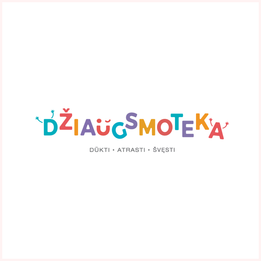
We came up with the name by combining the word Džiaugsmas, which means joy in Lithuanian, and –thèque – an Ancient Greek suffix describing a place where things are happening or kept.
As a result, Džiaugsmoteka represents the joy of playfulness and celebrations that children find in playgrounds.
Branding
Romp, Discover, and Celebrate are the main brand values which reflect the entertainment and educational components of the playgrounds.
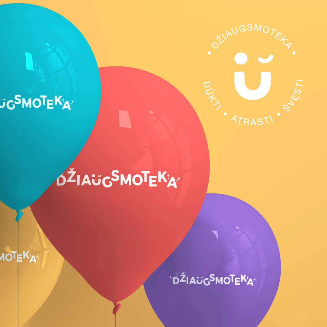
We wanted Džiaugsmoteka’s visual identity to reflect adventures, joy and create unforgettable memories. As a result, we created a playful logo with hands in the air that symbolize happiness and positivity. Džiaugsmoteka’s symbol – an emoticon with a winking face – playfully invites children to have fun at the indoor playground.
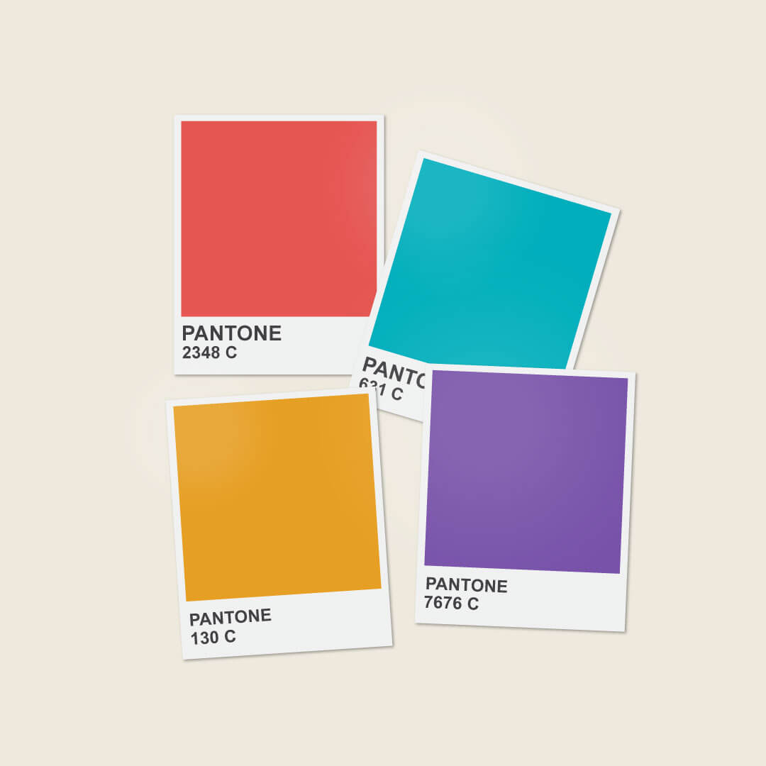
To reflect the brand’s adventurous spirit, we chose the four main colors based on red, yellow, purple, and green tones.
Ready to talk about (re)naming your company or project?