We collaborated with M-Connectus, a business that is specializing in consultancy and brokerage services within the wholesale telecommunications industry. We are delighted to have played a part in the project’s successful execution through the development of a visual identity.
Branding
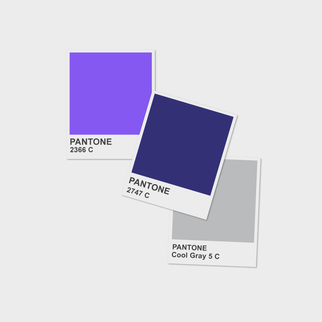
Forging connections is important. Therefore, coming up with the M_Connectus branded colors meant finding a sweet spot between M_Connectus solid experience and extensive network. We believe that a deep, rich purple color with a cool undertone, medium to dark blue color with a cool and slightly purplish undertone and light gray color with a cool neutral undertone perfectly balance each other.
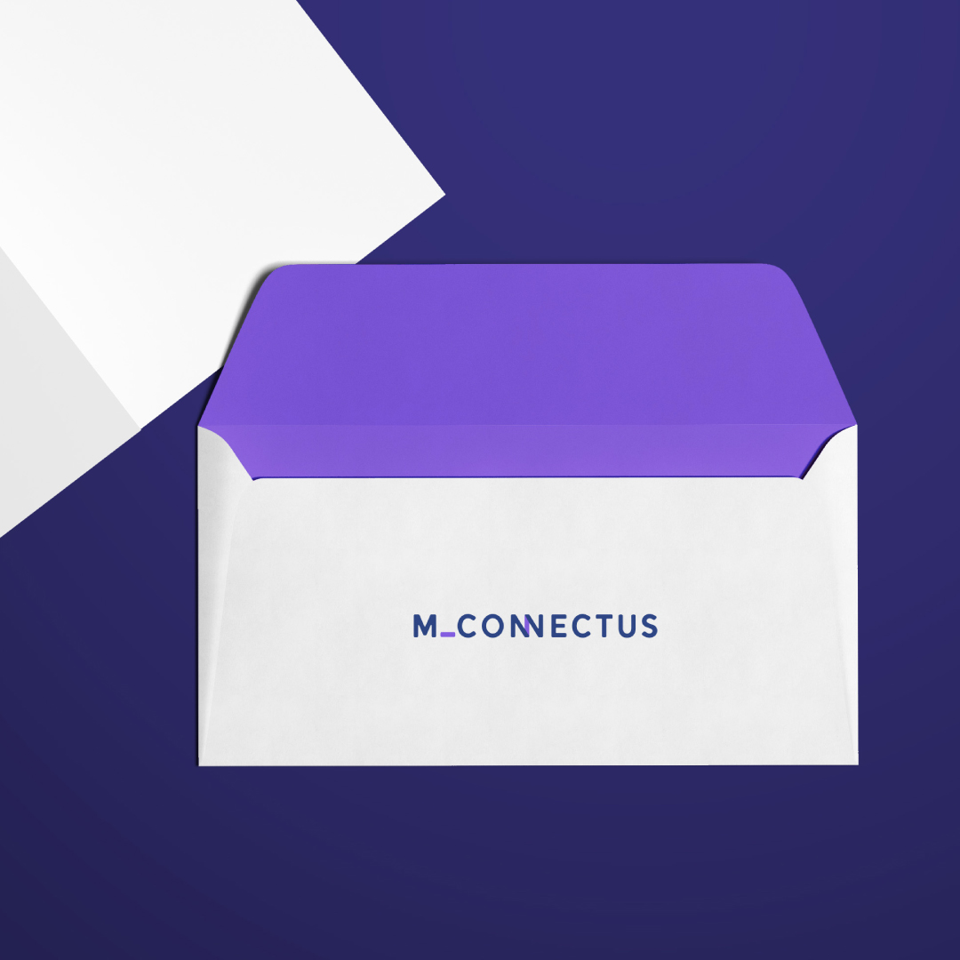
At its core, it’s all about connection whether it’s within the telecommunications industry or the extensive network of professionals that the M_Connectus team have. This is why we’ve opted for the overlapping NN letters, symbolizing the power of connection.
Website
The development of the M_Connectus website was driven by the goal of showcasing M_Connectus’ solid experience and extensive network, emphasizing the importance of forging connections in their line of business. To meet the trends of an ever-changing market, Gutenberg editor-powered website with clean, responsive and easily interchangeable blocks was chosen as the base to express the brand language of M_Connectus. The website was developed with external partner Tomas Šiurna.
Ready to talk about (re)naming your company or project?